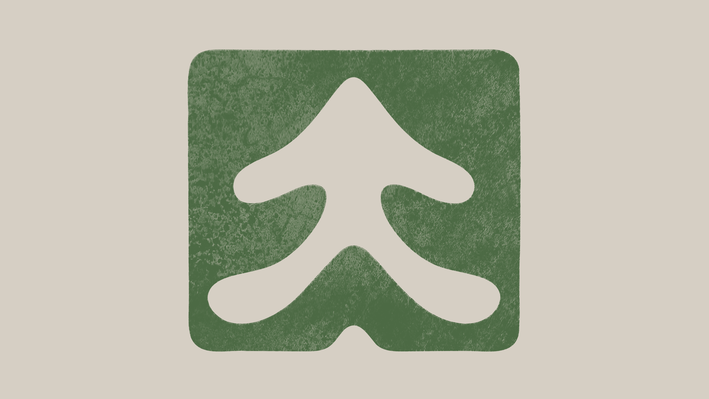
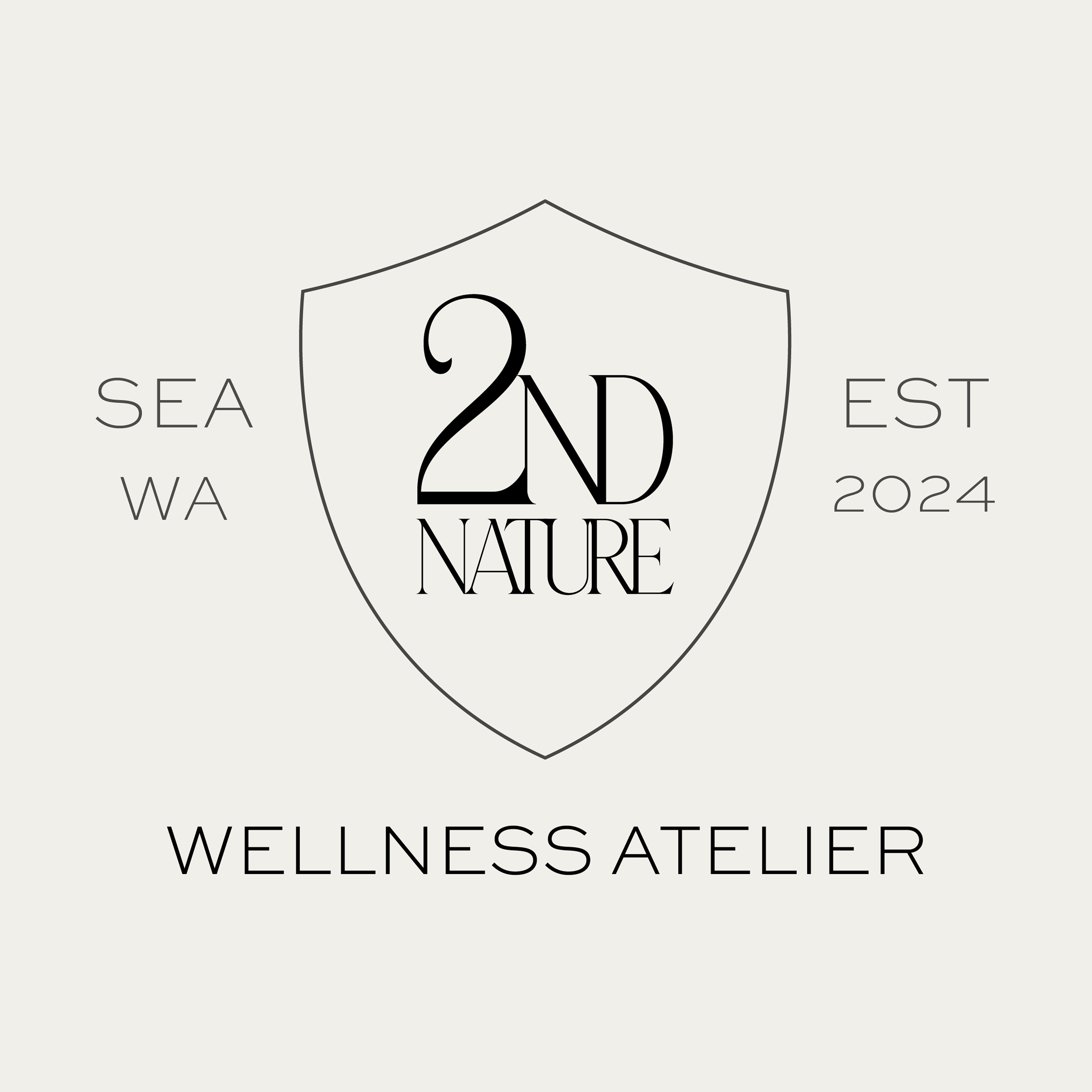
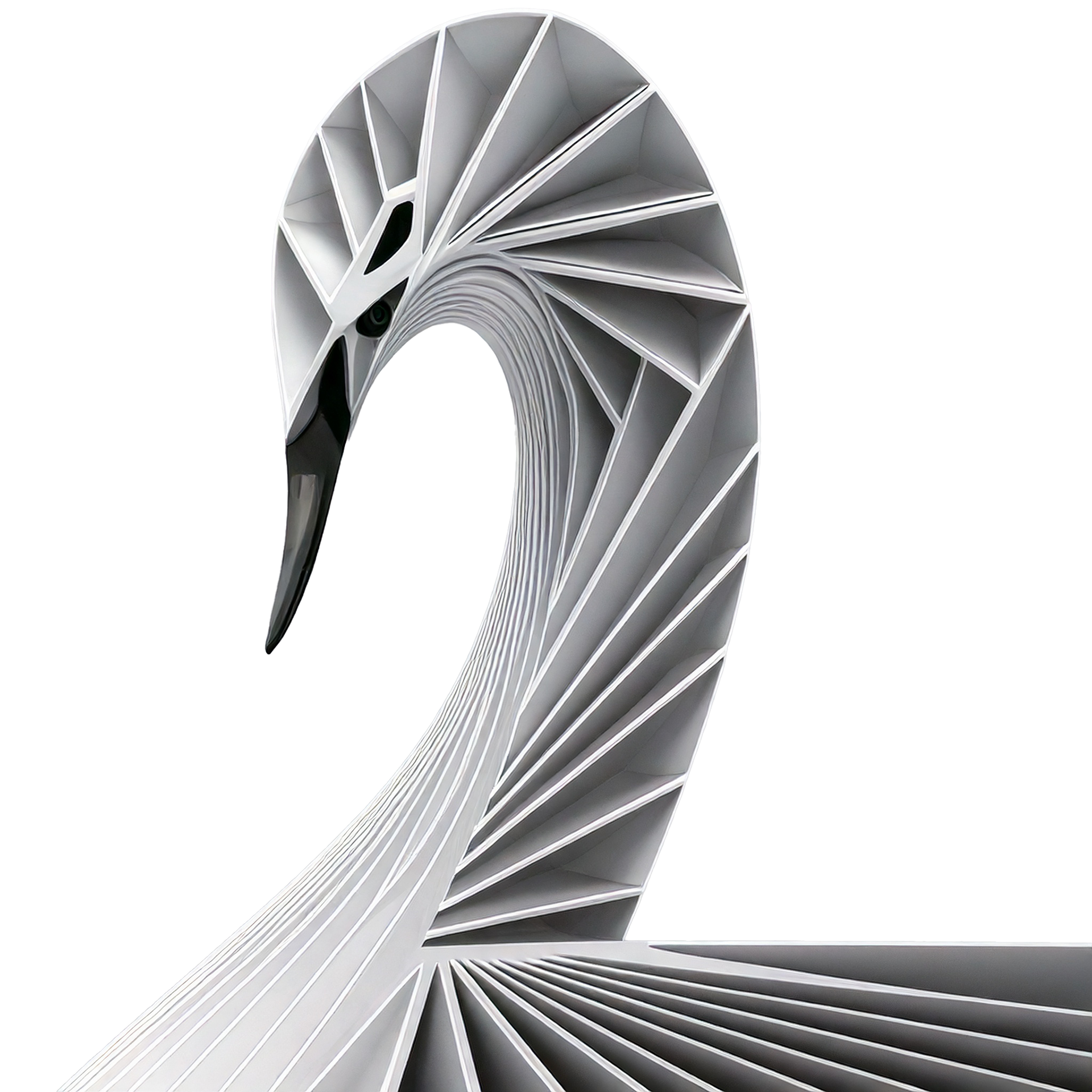
Identity work for 2nd Nature Wellness Atelier in Seattle. The form of the “2” was derived from a swan.
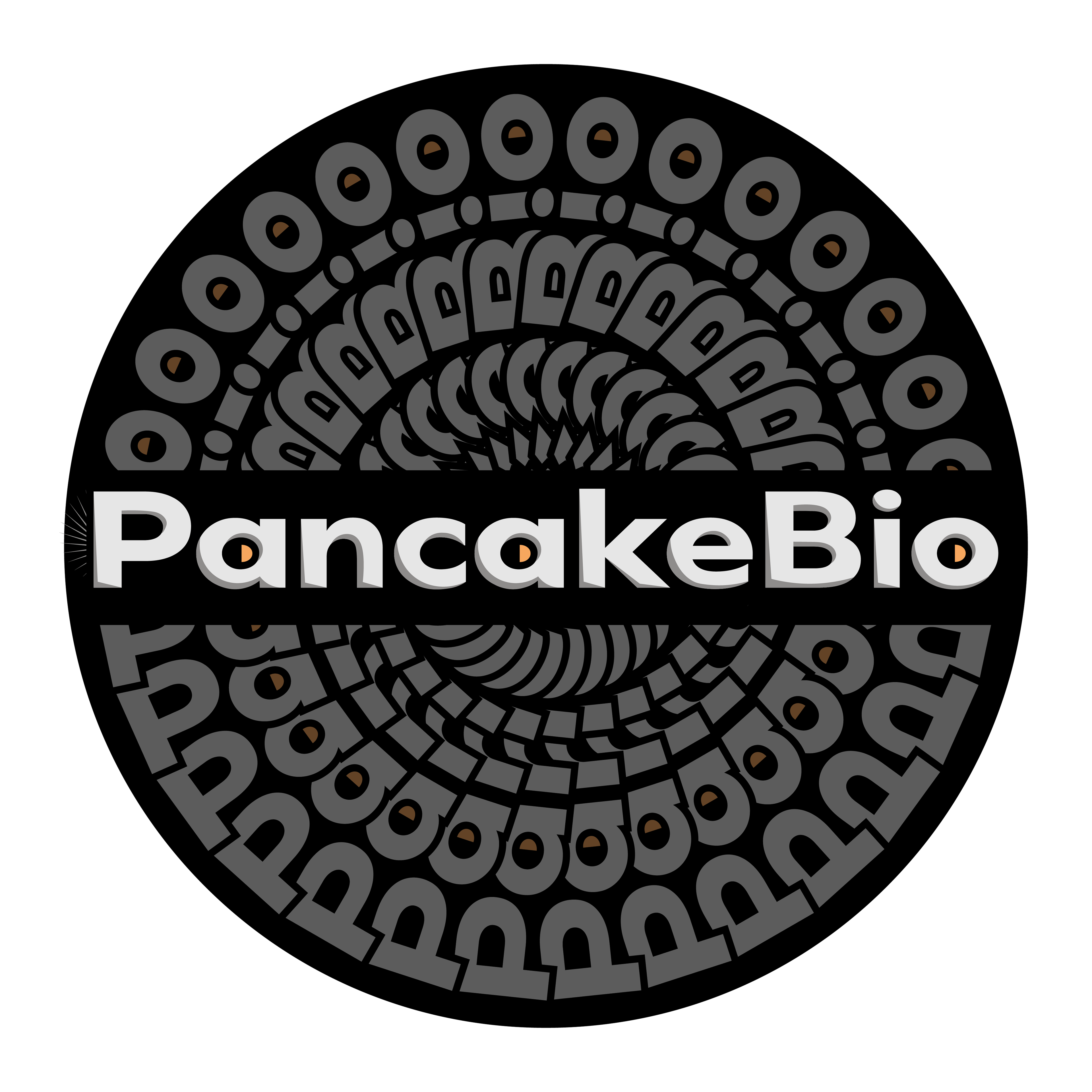
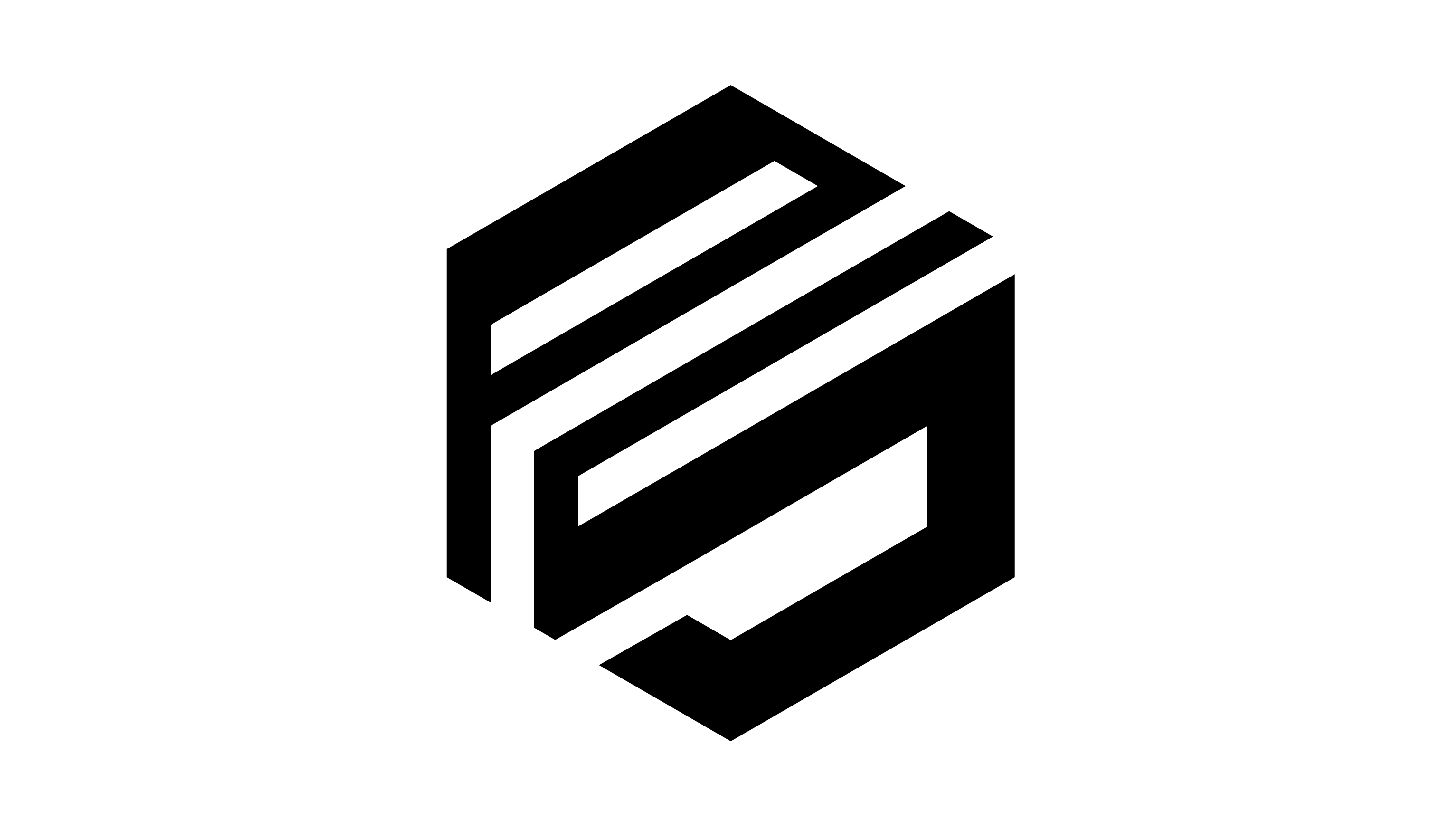
The Pancake Bio identity pairs architectural typography with internal bursts of warmth, reflecting a system designed to fuel growth. The embedded orange elements act as visual indicators of energy within structure — suggesting that beneath stability lies activation.